Instagram’s new rainbow sherbet vomit is currently causing a rift in the design community. Some people love it, while others absolutely abhor it. Personally, I kind of like it…kind of.![]()
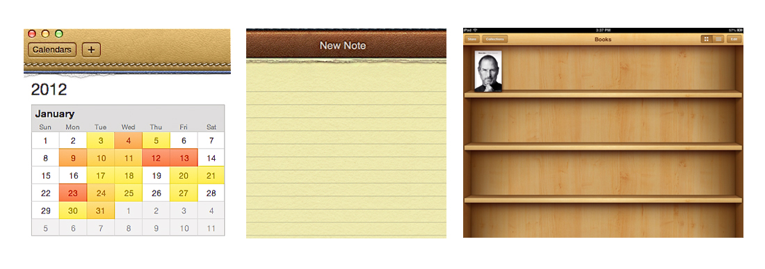
When Apple first launched iPhone, much of its interface followed skeuomorphic design principles. Skeuomorphic design pulls ornamental elements from real-life objects and brings them into the digital realm even though those elements are no longer necessary. For example, the top of Apple’s iCal App interface used to look like leather with stitching; the Notes App used to look like a real notepad with paper torn at the top; Apple’s Newsstand used to look like a miniature wooden book shelf…you get the idea.
The old Instagram logo was still stuck in this dated, literal representation of an object realm.
The new logo strips away all the unnecessary decorative elements and gives us the bare minimum of visual cues necessary for our brains to decipher that the logo is a representation of a camera. In my opinion, when it comes to app design, for the most part, cleaner and simpler equals better ease of usability.
Color doesn’t always equal tacky, and black doesn’t always equal elegant.
As for that rainbow gradient of colors in the background of the logo? The part of me that jumps for joy when seeing a rainbow—or even better, a double rainbow—loves it. I’ve never been one to shy away from color in anything in my life; from my wardrobe to design to my apartment decor.
Color doesn’t always equal tacky, and black doesn’t always equal elegant. Color, when used appropriately, can elevate a design to a whole new level, so don’t be afraid of it!
But another part of me worries that these colorful gradients are just a fleeting trend and five to 10 years from now, we’ll all be saying, “Oh, yeah, that was definitely made in 2016.”
Usually, good design doesn’t rely on short-lived trends. Logos like Coca-Cola, GE and IBM have stood the test of time because each were designed using unwavering core design principles and with longevity in mind. But then again, Instagram exists in a fleeting, temporary digital realm, so maybe they’re allowed to design something that won’t make it to the year 2116.
Overall, I’d say it’s an upgrade and a step in the right direction, but this new logo might be so simplified and trend-based that Instagram has given its new brand a very short shelf life.